Call-to-Action in Email: How to Design the Best One
CTA buttons are an essential part of any email, and they have a big impact on the success of your email campaign. In simple words, it’s the call to action for your audience, and it’s what will get them to take action on your email. Thus, the CTA button is one of the most important parts of an email as it reflects your sender’s intent.
If you are facing a dip in your conversion rates or thinking of revamping your email CTA button design, you are at the right place. I have curated a list of four foundational guiding principles with professional business email samples that you must follow to create CTA buttons that work in your favor. Let’s begin:
#1 Leverage Color Contrast for Your Email CTA Buttons
The CTA button can be made to stand out with contrasting colors as it increases the screen weight. This makes it easier for people to notice the button within your template and click on it.
Also, text with contrasting colors is easier for users to read, which makes the CTA button stand out more.
There are two ways of using contrasting colors for the CTA button. One is to use a light color on a dark background, and the other is to use a dark color on a light background.
The first way has been used in the past, and it is still used today by some email designers. The second way has been more popular in recent years, but it can be confusing for users who might think that the button does not work or that they have reached their destination when they have not.
Using a light color on a dark background makes it easier for users to see where they are clicking. It also helps avoid distractions like too much contrast with black text on a white background which can make it difficult for users to read text. Here are some professional business email samples for your consideration:
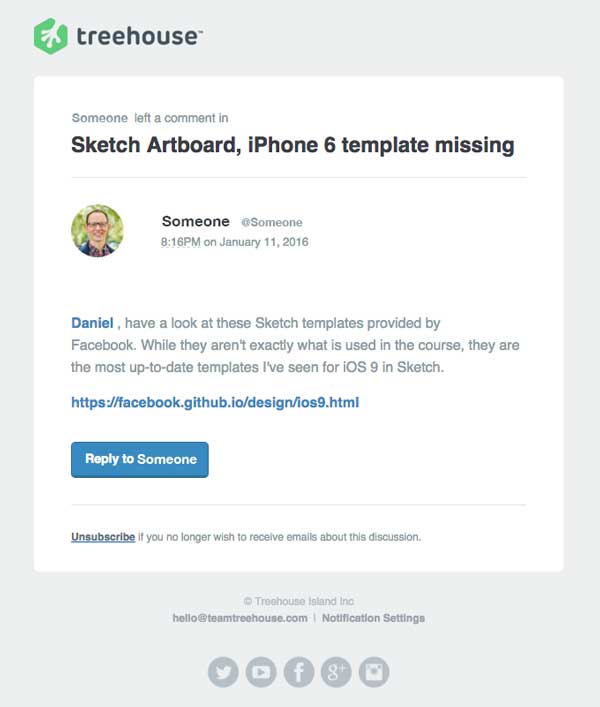

#2 Make Your Email’s CTA Button Interactive
The CTA button is located at the part where you want to get your visitors to take action. But some people might not click on the button because it may not look interesting or interactive to them given the high volume of emails (126/day) they receive.
There are many ways you can make your email’s CTA button interactive. Here are some examples:
- Have it change color based on how engaged they are with the email.
- Has it changed color based on how much time they spend on your website?
- Has it shown a different image depending on what kind of content they’re reading in your email?
- Have it change the color and text to something like “Learn more” or “Download now.”
To make your CTA button more interesting, you can also use an image like a call-to-action button with a countdown timer or a timer that counts down how long until an offer expires.
#3 Develop Short and Engaging Copy for Email CTA buttons
Your email’s CTA copy should be short and engaging so that readers can easily click on it and get what they need.
A good CTA button copy should be short, but it should also have a strong “call-to-action message” in it. When writing a CTA button, you want to make sure that you are telling your readers what they can do with the click. It should also make people want to click on it and take action immediately.
Here is a list of some tips for creating an effective CTA button:
- Make sure your button copy is short and catchy
- Keep it simple by using just one or two words
- Use a call to action that’s simple to understand, such as “learn more” or “get started.”
Also, when it comes to writing CTA button copy, it is important to remember that it should also be focused on the benefits of clicking the button like in this example:

You need to know what your subscribers are looking for so that you can create the CTA copy that signals that the subscriber will get exactly what they want. Also, you need to know what their pain points are so that you can address them in your CTA copy.
#4 Make Sure That Your Email’s CTA Button is Clickable
You should make sure that the text on the CTA button is large enough for people to read easily. You should also see that it is easy to click on it.
It should be large enough so that it’s easy to see and click on it. The size of the CTA button is relative to the size of your email’s text. If you have a short email, then the CTA button should be smaller than if you have a long one.
Also, the size of a CTA button depends on its position in an email and what it is asking for. For example, if you want to ask for a lead, then your CTA button should be large enough to make sure that people notice it and click on it.
The size of a CTA button differs depending on the device you are using:
- For smartphones, make sure that the CTA button is at least 44 pixels in width and 44 pixels in height.
- For tablets, make sure that the CTA button is at least 60 pixels in width and up to 72 pixels in height.
Summing Up
The CTA button is an important part of any email campaign. It’s used to drive conversions and increase customer engagement with your brand. However, a lot of people find it hard to interact with this important piece of content. With the four tips provided above, you should be able to avoid most of the troubles faced by your subscribers and inspire a higher click-through rate.
Next, can read: Top 7 Benefits of PSD to HTML Email Conversion.
Share


