Unlocking the Power of Interactive Dashboards for Team Engagement
Metrics is the name of the game in this complex digital business space.
And more than 75% of the world’s population would agree that visual representation is the best way to understand and learn about something.
But, how do we solve this?
Well, you’re in luck because interactive dashboards are the answer to this question.
These digital interactive dashboards are tools that can show all your business data in a visual and interactive manner.
In this article, we’ll get to know more about interactive dashboards, the role they play in visual communication platforms as well as the best practices to help you design your very own dashboard from scratch.
What is an Interactive Dashboard?
It is a kind of business data management tool that visualizes data and shows complex datasets and metrics in the form of panels.
It is not just interactive, it also allows its users to track, analyze, and monitor key business data from the same place.
DID YOU KNOW?
Interactive dashboards give the user the ability to zoom in and out of data, examine time intervals, filter information based on several parameters, and remove or hide parameters they may not want.
The Role of Interactive Dashboards in Visual Communication Platforms
These dashboards are versatile and customizable and come feature-packed with a lot of benefits.
Maybe this is the reason why they have become so popular in the employee communication platform recently.
This makes them a valuable asset for any business:
Enhancing Data Visualization and Accessibility
Good data visualization is the key to finding out the insights hidden in huge sets of data.
By displaying complex data in an easily understandable format (like charts and graphs), interactive dashboards allow all members of a team to check on, analyze, and decipher all business data easily and help them make better business or project-related decisions.
Promoting Collaboration and Information Sharing
Since it displays all the data within one space in easily understandable formats, it acts as a hub for employees to join in, collaborate, and see real-time changes that their efforts have brought in.
It also allows the team to easily share their opinions and knowledge.
Driving Employee Engagement and Motivation
Interactive dashboards can bring in a sense of ownership and involvement of the employees within the organization.
Since they can track their progress and see the real-time impact their changes have brought to their work, they get a sense of responsibility and have pride in their work.
Example of Interactive Dashboard for a Sales Company
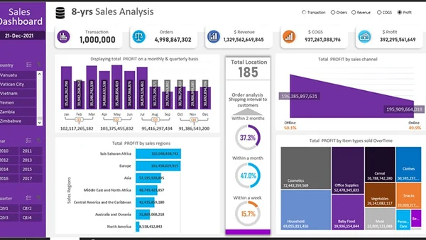
The above screenshot is a sample interactive dashboard used in a sales company.
Best Practices for Designing Informative and User-Friendly Dashboards
If you’re thinking of designing your very own interactive dashboard, you need to keep in mind that usability and relevance is the key here.
While a visually appealing dashboard can awe your employees, it needs to show relevant data to be effective in improving your business processes.
Here are some best practices that many industry experts recommend you use when designing your interactive dashboards:
Choose Relevant Metrics
You know, any data is only usable if it’s the right kind of data.
Display only the most important data points and KPIs on your dashboard.
This way your team/ employees will not get overwhelmed or distracted by useless data and focus only on the stuff that matters.
Prioritize Clarity and Simplicity
Well, nobody likes a screen that is only filled with ugly charts and graphs.
A well-designed dashboard has to be visually appealing.
But that’s not all, it needs to be easy to understand too.
Choose a clean and minimalistic design with a color scheme matching your company colors or brand so that it does not distract you from looking at the data itself.
Ensure Responsive Performance and Cross-Device Compatibility
Your employees won’t always be looking at your dashboard from a computer screen.
It’s important to make sure that your dashboard is accessible from different devices and platforms.
Be it a desktop, laptop, tablet, or smartphone, your dashboard should not only look good, it should be able to load up fast from any of these devices.
Include Interactivity and Real-Time Updates
This is another real advantage of interactive dashboards, it allows its users to manipulate, customize, explore, and customize the data view to suit their needs.
Your team should be able to select and choose the kind of data/ metric they want to see based on their project or preferences.
So make sure that your interactive dashboard allows sorting and has drag-and-drop features to show different kinds of data according to user needs.
Plan for Scalability and Maintainability
A business is nothing if it does not grow.
So as your business changes, make sure your interactive dashboard changes too.
This means that the more growth your business sees, the more your dashboard should adapt to that growth.
You can also introduce new features and metrics in the future as the need arises.
So, design your dashboard with future scalability and performance in mind.
Conclusion
Understanding the metrics is the core part of many businesses.
Each has their own needs and preferences. Having a way to visualize and show data in an easy-to-understand format in real-time becomes a necessity.
Interactive dashboards have become the standard for data visualization in this complex business world.
Understanding how you can effectively understand and use this can set you apart from the competition.
Share