Craft Responsive Email Templates That Look Great And Boost Conversions
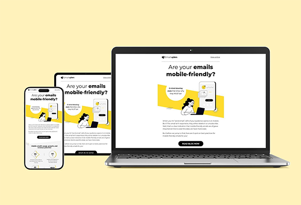
With 71.5% of consumers choosing to check their emails on mobile, how you deliver your message matters.
Your audience wants to receive emails in a way that fits seamlessly into their lives. But if your emails aren’t optimized for mobile, you might lose their attention before they even start reading.
And why just mobile?—28.5% of users also rely on desktops, tablets, and even smartwatches to check their emails.
The way people consume content has changed dramatically. Subscribers often switch between devices—whether they’re at their desks, relaxing on the sofa, or even sneaking a glance at their smartwatch during a meeting.
If your emails don’t display correctly on these varied screens, you could be missing out on a significant share of potential revenue.
Enter responsive email templates.
These high-performance email templates are designed to adapt to whatever screen they’re viewed on, whether a phone, tablet, or desktop.
The flexibility ensures your emails are always easy to read and navigate, no matter when or where your subscribers open them.
And why does that matter? Because when your audience engages with your emails, they’re more likely to click, and more clicks mean better conversions.
So, how do you make sure your emails hit the mark? Keep reading to discover the best practices for responsive email design and how to implement them to boost engagement and conversions.
What Is Responsive Email Design?
Responsive email templates are designed to adapt effortlessly to any screen size or device. Whether your email is opened on a smartphone, tablet, or desktop, the layout, images, and text automatically adjust to provide the best possible viewing experience.
In simple terms, responsive email design ensures that your emails are easy to read and navigate, no matter the device.
What’s great about responsive email design is that you only need to create one design, and it’ll look great no matter where your subscribers view it. No need to stress about which device they’re using.
And because these responsive emails display perfectly across all devices, your subscribers might start reading on their phone and then later revisit the email on their laptop or desktop—especially if that’s where they feel more comfortable making a purchase. This seamless experience keeps them engaged, no matter how or when they choose to interact with your email.
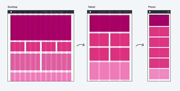
Here’s how responsive email design ensures that your content flows smoothly on smaller screens and remains easy to interact with.
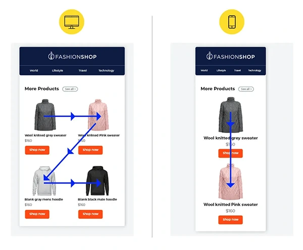
It uses section stacking, rearranging content sections to appear one below the other when viewed on smaller devices. This keeps everything organized and easy to read, no matter the screen size.
Ensuring your emails look great and work seamlessly on any device lets you reach a broader audience and provides a better experience for your readers.
This level of care can result in higher engagement and improved campaign performance. Let’s dive into the benefits of responsive email design.
Benefits of Responsive Email Design Templates
Improved Email Readability
When your emails automatically adjust to the screen size, the text and images stay clear and well-organized. By using clear fonts, generous spacing, and easy-to-navigate layouts on smaller screens, responsive emails improve both readability and accessibility.
Whether someone opens your email on a smartphone, tablet, or desktop, they’ll have no problem reading or interacting with your content. This kind of accessibility ensures that your message gets across effectively.
This optimized experience keeps users engaged and makes them more likely to take action—whether making a purchase or signing up for a newsletter—which ultimately leads to higher conversion rates.
Better User Engagement
Responsive email design keeps users from abandoning your emails due to poor formatting issues. Responsive design fixes that by creating a user-friendly experience. When your emails are easy to interact with, recipients are likelier to click through, check out your offerings, or even share your email.
The clean and professional look of such emails encourages deeper engagement, making your brand feel reliable and customer-focused. As users spend more time with your email, they start to see your brand as one that cares about their experience, no matter their device.
Higher Open and Click-through Rates
Another big advantage of responsive email design is that it boosts both open and click-through rates. When recipients can easily read and interact with your emails on their favorite devices, they’re more likely to open them in the first place.
A well-designed, responsive email makes your calls-to-action stand out and easy to access, encouraging more clicks. This means your CTAs get the attention they deserve, helping you achieve your marketing goals.
With clear and compelling CTAs and an easy-to-navigate layout, responsive design helps drive higher engagement and conversions.
Design Best Practices For Responsive Email Templates
Follow these best practices to make your email campaigns more effective:
Use Pre-built Responsive Email Templates
There are days when inspiration just doesn’t strike. That’s when customizable responsive email templates become your best friend.
Most email marketing platforms today offer a “template gallery” packed with ready-to-edit options, many of which are already responsive. All you have to do is pick one, drop in your content, and voilà—your email is good to go!
There are plenty of free and paid responsive email templates available from providers like HubSpot, Brevo, Stripo, Litmus, and Mailchimp.
These templates are designed to look great on any device, so you don’t have to stress about how your email will appear on different screens. By using these responsive email templates, you can save yourself time and effort while still sending out professional, polished emails that your audience will love.
Use Fluid Grid System
One of the key elements to nailing responsive email design is a fluid grid system.
Unlike fixed-width grids, a fluid grid system uses percentage-based widths. This means that your email’s columns will automatically resize based on the screen size on which they’re viewed.
When you use percentages for widths, you’re setting the size of your columns relative to the screen size rather than giving them a fixed size in pixels.
Let’s say if a column is set to be 50% of the screen’s width, it will always take up half of the screen, whether the screen is a small mobile phone or a large desktop monitor.
So, as the screen size changes, the column size changes proportionally because it’s based on a percentage of the screen’s width.
This flexibility allows the email layout to automatically adjust—shrinking on smaller screens and expanding on larger ones—without losing structure or becoming difficult to read.
Thus, using a fluid grid system avoids common issues like content overflow or awkward spacing, which can make your emails look messy.
Optimize Images
Images and GIFs can bring your emails to life, making them more dynamic and visually appealing.
However, images can be a bit tricky in responsive email design. If not handled properly, they can either enhance the experience or cause major issues.
The key to getting it right is finding the balance. Avoid using too large images, as they can make your email slow to load.
On the other hand, using images that are too small can lead to distortion or pixelation, making your email look unprofessional.
To ensure your images always look their best, it’s important to use scalable images that adjust smoothly to different screen sizes. Also, compress your images to reduce load times without sacrificing quality—this keeps your emails snappy and engaging.
Remember to add alt text (alternative text) for each image. This helps users understand what the missing image relates to if it doesn’t load and improves your email’s reputation with clients. Spammers often skip this step, so including alt text can boost your emails’ credibility.
Lastly, avoid creating emails that only contain images. To make your responsive email templates effective, aim for a text-to-image ratio of 60:40.
Be Concise
Understand that no one has time to scroll through a never-ending email, especially on a tiny screen. That’s why keeping your emails concise is a must.
A single-column, narrow design is your best friend here. It ensures that your email doesn’t turn into an overwhelming wall of text when viewed on a phone.
Instead, break your content into bite-sized paragraphs and give it some breathing room with plenty of white space.
Also, pay attention to your font size—16px is a good standard for readability on mobile devices.
Easy-to-Tap CTAs
A call to action (CTA) is the heartbeat of any email—it’s where you guide your readers to take that crucial next step.
But your CTA must stand out, especially in a responsive email, where screen sizes vary.
So, make sure your CTA buttons are clear and easy to tap.
Use a contrasting color for your buttons to stand out and make them large enough to avoid mistakes—think about 44 x 44 pixels as a minimum size. This way, even those prone to “fat finger” errors can tap them easily.
Avoid using links or images for CTAs; they can be hard to click or not appear. Also, space out your buttons to prevent accidental clicks on the wrong one.
Legible Fonts
When it comes to responsive email design, especially for mobile readers, legibility is crucial. People often skim emails on the go, so ensure your email content is clear and impactful. Use concise, powerful language to capture their attention quickly.
For readability, opt for larger fonts. Stick to at least 14px for body text and 22px for headlines. This ensures readers don’t have to pinch or zoom to read your email. Choose standard fonts like Arial, Times New Roman, Georgia, or Verdana—these are universally available and easy to read on any device.
Size matters here: ensure your typeface is large enough so readers don’t need to strain their eyes. Also, include ample white space between content blocks. This makes your email look cleaner and prevents it from overwhelming your readers.
Test Your Responsive Email Design
A well-designed email on the desktop doesn’t always translate perfectly to mobile. So before you hit “send” on your next email campaign, it’s crucial to test how your design looks on mobile devices. Check if it’s easy to read and navigate on smaller screens.
Many email marketing platforms offer built-in tools to preview how your emails render across different devices and email clients. Use these tools to spot any issues and make necessary adjustments. Testing different designs and approaches can help you understand what resonates best with your subscribers.
Wrapping Up
Responsive email design is key to grabbing attention and boosting engagement. It makes sure your emails look great and work well on any device.
Following responsive design principles enhances readability, improves user experience, and increases your open and click-through rates.
A well-designed responsive email template ensures that your message keeps your audience interested and drives better conversions from your campaigns. So, take the time to make your emails adaptable and user-friendly—it’s well worth the effort!
Share